This article will walk you through some general Design rules that might come useful when creating OTT Apps, and how to avoid mistakes that might come up while working on your project.
Let's start with the basics, what is a 10-foot TV experience?
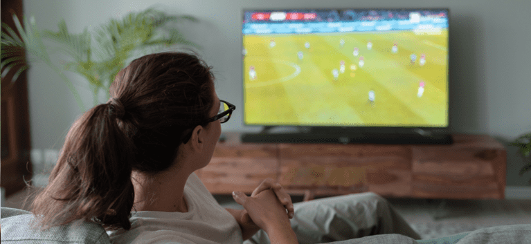
As the name implies, we refer with it to all devices and platforms that are meant to be experienced at a mid range distance of approximately 3 meters, usually through a remote control or in some cases with voice commands, so as you might have guessed, the TV is the main medium to explore and navigate those experiences right now, but, the source can come from different types of devices such as gaming consoles, streaming boxes, smart speakers or even your own phone. Having a giant range of possibilities of what you can actually experience there, such as movies, games, video calls, light hubs, music libraries, among many, many others.
What should you do before designing a 10-foot TV experience?
- If you are not a heavy TV user, start being one in a “critical way'', recognize the annoyances that you have as a user with specific steps and realize the reasons why, and don't focus too much on the final goal, understand the path and process of how you got there.
- Familiarize yourself with the specific device you are going to design for. If you come from designing experiences for web, Android or iOS, you already know each one has different requirements and sets of rules, which have a direct impact on your Design process. You can save some time by identifying particular boundaries that your device may have.
-
As with every Design approach, you need to understand your users, it is very likely that the patterns and general rules of engagement vary greatly among them, so it is important that you recognize not only the goals they are trying to achieve, but also the context on which these goals are happening and how this can impact the experience, structure, layout, colors and even the information architecture.
So what makes it so particular to Design for?
The origin of this experience comes from the good old days of just sitting on the couch with the family to relax and enjoy whatever show was on, without giving it too much thought.That concept hasn’t changed that much, even though nowadays we have endless possibilities with each device, you still need to design the experience having in mind that your user is there to lower the pace of their day and chill, that means: less attention and less patience for the steps you set up for each goal. But that is just the general concept, let’s run down through some key parts of that experience.
Immersion
OTT systems have been focusing on creating seamless experiences, understanding that the time you actually put into entertaining yourself is a valuable one, so the platforms have been pushing the boundaries of their capabilities to create an easier and more engaging experience for you to be able to spend less time navigating through them and more achieving your actual goal within them.
And yes, it is the job of that goal or content to keep your user engaged, but your job as a Designer is to create an environment that immediately catches your user's attention and allows them to explore a fairly complex structure of information with the same ease and comfort as sitting down on their favorite couch.
Controls and Navigation
This is probably the biggest challenge you’ll face over your Design process. You have to realize that each OTT device has its own type of controls, sometimes even two or three different ones, some other times it will have a third party device attached to the experience, and it’s more than likely that is not going to be the usual mouse and keyboard or the already familiar touch gestures, so the way interaction works will greatly vary on the options your specific device has at hand.
For the sake of creating a foundation we are going to talk about the most common type of control: a basic remote with 4 directional arrows, a confirmation button and a back button. With just those 6 inputs and a single focus state over the elements on screen, you have to achieve goals such as finding and opening a specific content, managing a list of preferences and settings, completing navigation of a player with all their correspondent options and even supporting a full account creation process with an extended on screen keyboard. So yeah, it can get messy really fast!
The general rule we need to have in mind to build each flow is to find the path with less resistance to achieve that goal, that means less types of actions per screen, guided user flows through "narrowed" paths with less to none secondary roads, and a clear differentiation of use for each component.Viewing distance
Our capabilities to understand something change dramatically with distance, recognizing a poster from a movie on our phone is easy enough when you are scrolling through content, however it is a very different story just one or two meters away from it, your ability to interpret images, texts, details and concepts gets challenged, to begin with you need more time and care, modifying the level of effort, making the experience the complete opposite of what we are trying to achieve, so it's important to readjust the mindset of how we design elements on-screen.
What do you need to have in mind to design for OTT?
We have spent the last decade and more polishing and refining the experience to watch content in our phones and computers. According to “The full Digital 2021 global report” by Datareportal, a regular person spends something between 6 to 10 hours per day using these devices, and by now it comes as a natural thing to do.
However, this is not the same for OTT systems. Besides the traditional TV box there wasn't any real need of working massively upon improving this interface, but the influx of multiple new types of OTT devices has allowed us to be able to watch it rise again as a relevant component of the Entertainment world, and we want to help you in your journey to start designing for this new wave of product development. For this we have set some basic guidelines that can help you as a starting point:
Screens
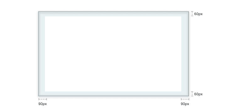
- TV Screens as many other screens require safety areas to work with, this rule has been bent many times over the years, specially during the change of TV content format from 4:3 to 16:9, so it originally started with the use of a 90% width x 90% height for the visible real state of the screen, and today you can find it being as close as 96% width x 97% height in some cases, we recommend you to start with 95% all around and go from there to adjust to your product needs.
(Example: on a 1920px x 1080px resolution an usual margin would be L - R = 90px (4.7%) and T - B =60px (5.5%))
- Many OTT devices, even today, keep support for 720px resolutions and go to even 8k, what you will need to figure out is the boundaries of your specific platform and plan accordingly to create your assets.
- Beware of overscan, some devices today still try to enlarge contents to try to remove black borders from the original format, and they have this as a setting in their systems for which you have to plan ahead.
Colors
Colors on TV screens are dependent on the technology of the device, but as of today there are 2 particular pieces of advice we can give you.
- Don't use saturated colors: the general configuration for these devices is setup to work for media content, and usually lack smart adjustments for platform navigation, which results in oversaturated colors, unbalanced contrast and related issues, so it is your job to mitigate this issue by using alternatives that don’t burn your users eyes, specially for its natural dark environment.
- Contrast is there to support readability: one of the easiest things to lose in the constant interaction of content assets and components is contrasted colors, it is pretty likely that you are going to work variable image assets so try to keep that mind and plan ahead, look for edge cases, make use of color containers, or use overlay layers to mitigate the effects, whatever you have on your tool-belt for these cases it’s gonna make a difference.
Layout grids and components
- Most systems work on a 4x scale, and we can't stress this enough. Defining the base metric system is going to help you normalize the gutter, asset scales and general spacings and component structures which are going to be present in every part of the platform, but have in mind not all OTT devices work on an even number scale base, some, such as Roku systems, work on 3x scale which might sound unfamiliar from previous experiences, so find out your system preferences before committing your Design System.
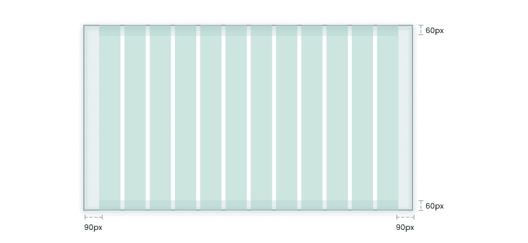
- For the grid it's recommended to work with the traditional 12 column system just within the defined work area, that will allow you a more flexible workspace to try out multiple components structures to create differentiation and hierarchy among them, but this is just a suggestion, you can adjust the number of columns to your specific needs.
-

(if we continue with our 1080 resolution example with a 90px x 60px margin, that will leave us with columns of 123px width and gutters of 24 px within the safe area)
- When you start creating component structures make sure you use blocks at least 2 columns wide for components, that way you’ll ensure enough space for texts or inner elements visibility.
- Components may come in all shapes and sizes, after you ensure minimum readability.
Fonts
As we mentioned before, readability is one of the most affected parts of the experience, so you have to make sure fonts in particular have some healthy rules.
- The minimum size for text should be 24px, you'll realize working on your computer that sometimes that can feel too big, but trust me, when you take that minimum size to the TV screen and the proper distance you are gonna notice it otherwise.
- Try to keep font scaling consistent (24 - 28 -32 -, etc.) to build hierarchy according to your system and components needs.
- Font variation is extremely relevant to make hierarchy levels of information clear as with any other project, however we recommend to stay clear of low visibility variations such as Thin and Light, but of course it will depend on the font itself.
- We encourage you to try blown out font sizes and explore with crazy ideas on how to make that work with long titles to create a more accessible environment.
Final thoughts on OTT 10 foot-Design
Even though TV screens have been around for a longer period of time than other devices, the whole interface system for them is relatively new, there is a long road ahead full of new discoveries, better technical responses, multiple linked interfaces and why not, disruptive design experiences, we are just barely scratching the surface.
So, if you are not trying to break it, something isn't right!
As a Designer you’re going to encounter a lot of limitations along the way: technical difficulties, nonexistent services, brand rules, business rules, traditional experiences and best in market examples, among several others. If you want to move forward towards new frontiers you have to push all of its boundaries in a structured way in which you add all teams involved in the process, from developers to product owners and above.
Ready to get started with your next 10-foot TV experience?
Contact us today to learn how Zemoga’s OTT App solutions have been driving innovation in Media & Entertainment for over 15 years for brands like Roku, Hulu, Sony, and HBO.
Are you an experienced UX/UI Designer?
Send your CV and portfolio to design 10-foot experiences with us!

